Best Overall
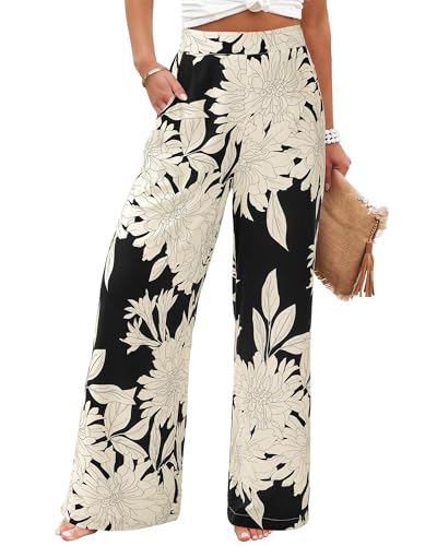
BTFBM Floral palazzo trousers
Named black-apricot floral palette supports straightforward color repetition.
Exact motif placement and fabric are unverified.
View on AmazonStyle
Put printed palazzo pants on a hanger and choose the first color you notice. Now look again for the color that occupies the most space. Those may be different, and either can guide the top you wear. A small bright flower can inspire an accent; the darker background can support a quieter outfit.
The print already supplies several decisions—color, scale, spacing and direction. You do not need to solve all of them at once. Begin with one plain top, then decide whether the finished outfit would benefit from another texture, a repeated color or a second pattern.
As an Amazon Associate I earn from qualifying purchases. Purchases take place on Amazon.
Best Overall
Named black-apricot floral palette supports straightforward color repetition.
Exact motif placement and fabric are unverified.
View on AmazonBest Budget

Lower-priced black floral palazzo example for a plain-top outfit.
The title does not describe every print color or scale.
View on AmazonBest Premium

Higher-priced beige floral elastic-waist palazzo alternative for print-led styling.
The price tier does not establish better pattern matching or fabric.
View on AmazonThese are editorial shopping starting points based on listed details, not hands-on tests. Budget and Premium describe relative asking-price tiers among the featured options when researched; they do not establish product quality. Confirm the selected size, composition and current price on Amazon. How we choose examples.
First identify the background: the color visible between the flowers, dots, lines or other shapes. Second identify the largest motif. Third notice the strongest contrast, which may come from a small bright detail rather than the biggest shape. This gives you several potential outfit anchors instead of assuming that the loudest color is the only option.
View the pants from a distance as well as up close. A small busy pattern may read almost like a blended color across the room, while a large widely spaced motif remains distinct. Neither is inherently better for a particular body. The useful question is how much visual activity you want the trousers to contribute to the complete outfit.
A background-color top creates a quieter transition into the pants. A top that repeats a small accent pulls that color forward. A neutral that does not appear in the print can still work if you like the combination. You do not have to find a perfect match for every outfit, especially when the top is visibly different enough to look intentional.
Try all three directions with clothes you own. A floral print with black ground and pink details might work with black, a compatible pink or a plain cream top. The first emphasizes continuity, the second emphasizes color, and the third introduces contrast. Choose the version that fits the occasion and your mood rather than treating one as the correct answer.
| Print type | Easy starting top | Useful detail to inspect | Next experiment |
|---|---|---|---|
| Large floral | Plain background color | How motifs appear across both legs | Repeat a small petal or leaf color |
| Fine stripe | Solid shade from the stripe | Contrast and spacing from a distance | Add a different-scale accessory pattern |
| Polka dot | Solid background or dot color | Dot size and density | Introduce one contrasting color |
| Geometric | Simple top with a clear hem | Large shapes near seams and pockets | Use a structured outer layer |
| Animal-inspired | One quiet neutral | Actual colors rather than the print name | Try a muted colored knit |
| Multicolor abstract | One of the less dominant colors | Whether the design blends at a distance | Repeat one accent in the bag |
The table is a set of starting experiments. A floral can be graphic and restrained; a stripe can be bold and colorful. Look at the actual garment before deciding how much additional pattern or color the outfit can comfortably carry for your taste.
Large flowers can become the outfit's main feature when paired with a plain top. Let their scale remain visible by avoiding an outer layer that covers nearly all of the design, unless you specifically want just a glimpse below a longer jacket. A small repeated color in the top can make the combination feel connected without matching the entire palette.
For a dense floral, try a quieter blouse or tee first. If you want a more expressive look, add a colored jacket that relates to one part of the print. Assess the result with the jacket on, because it changes how much patterned fabric remains visible. You can build complexity gradually without assuming floral trousers belong only in vacation outfits.
Striped palazzo pants can range from nearly tonal fine lines to broad bands. Use those visible differences to choose the top. A strong stripe may feel complete beside a plain knit; a subtle stripe may leave room for a more detailed blouse. Avoid body-shape promises about stripe direction. The practical styling question is whether the line pattern is a quiet texture or a prominent graphic element.
Check how the stripes look at the waistband, pockets and seams if those areas matter to you. Pattern placement can vary between garments and sizes. A product image of one sample does not guarantee the same stripe arrangement on every pair. When shopping, inspect the selected item information and any close views rather than assuming all striped trousers are constructed identically.
A two-color dot print gives you a simple starting palette. Wear a top in either color for a coordinated effect, or introduce a third color you enjoy. The amount of contrast depends on dot size and spacing: widely separated large dots remain obvious, while small dense dots may read more like texture from a distance.
For an everyday outfit, try dotted pants with a plain shirt and uncomplicated shoes. For a playful version, use a colored top or accessory, but check whether both are necessary. The dots already provide repetition. One extra accent may be enough to establish the mood without requiring a matching set of bag, earrings and shoes.
Use the same questions for a geometric or animal-inspired pattern: what are its actual colors, how large are its shapes, and how much contrast does it create? A muted animal-inspired print can behave more quietly than a high-contrast floral. A geometric print can feel restrained or exuberant depending on the design.
A simple top with a clean hem can make a graphic trouser shape easy to see. A relaxed knit may soften the overall appearance. Choose based on the outfit you want, not an assumption that a print name determines personality or occasion. Workplace and event suitability still depend on the specific setting and the whole garment.
If you want two prints, give them something in common. That could be one repeated color, similar contrast or a shared background. Then introduce a difference in scale so they do not appear to be competing versions of the same design. A small-patterned scarf above larger motifs is a low-commitment place to begin.
Put on the complete outfit and look from several steps away. If it feels too busy for your preference, replace one print with a plain piece. If you like the complexity, keep it. There is no need to justify an expressive combination through a universal rule; the method simply helps you see which relationship makes the pairing enjoyable to you.
A plain color does not mean the top must be fitted. You can use a loose shirt, a compact boxy top or a longer tunic according to your preferred coverage and proportions. Decide where the hem should sit in relation to the waistband and the visible print. A long top may conceal part of a large motif; a tuck may reveal more of it.
If you like the color but dislike the outfit, try changing the top's hem arrangement before abandoning the palette. A small tuck, an open layer or a different shirt length can alter the result. For the practical methods, see tucking tops into palazzo pants. Keep print balance and fabric bulk as separate decisions.
Arolina polka-dot palazzo pants are a title-supported example for the two-color starting method. Verify the selected listing image and variant before choosing the top, since the title alone does not describe dot dimensions or all colors. Their casual positioning is a useful starting context, not a limit on your personal styling choices.
BTFBM floral black-apricot printed palazzo trousers name a different palette in the verified title. A black or compatible pale top offers a straightforward experiment. The title does not establish fabric composition, exact motif placement or opacity. Use the named print and colors as prompts, then inspect the actual garment details before planning a complete outfit.
A plain shoe can leave attention on the trousers, but plain does not have to mean black. Use a color from the print, a neutral you already own or a contrasting accent if you want the shoe to show. Remember that very wide hems may conceal most of it. Spend effort on the visible relationship rather than details that never appear.
Long Tall Sally's wide-leg styling suggestions show footwear changing with outfit context. Apply that as a source of ideas, then check your own hem and walking plans. Sneakers, flats and dressier shoes can serve different versions of a printed outfit; the print itself does not dictate one shoe family.
Add your bag and outer layer last. A patterned bag may be the second print you want, or it may distract from a trouser design you prefer to keep central. A large necklace can become another strong shape near the face. Judge those additions in the complete outfit rather than assuming printed pants require an accessory ban.
When you find a combination you like, save a wardrobe note that identifies the exact top and shoes. A different shade of a similar top can change the palette. The useful lesson is the relationship that worked—background repetition, accent color or contrasting scale—so you can apply it thoughtfully to another print without copying every item.
No. Repeating a color is an easy starting method, but a compatible neutral or a contrasting shade can also work. Compare the actual pieces together. If an almost-match looks unintended, choose a clearer contrast rather than searching indefinitely for an identical shade.
Yes, if you enjoy the combination. Try a repeated color and a noticeable difference in pattern scale, then view the outfit from a distance. If both prints feel equally demanding for your taste, replace one with a quieter version or move the second pattern to a smaller accessory.
There is no need for a blanket ban. Large motifs create a different visual effect from dense small patterns, and either can be appealing. Consider how much of the print is visible beneath your top or jacket and choose the scale you enjoy wearing, without body-shape restrictions.
Printed palazzo outfits become easier when you identify one clear relationship between the pants and the rest of the look. Repeat the background for quiet continuity, repeat an accent for color, or introduce a second print with a deliberate difference in scale. Keep the top's shape and the shoe's practical fit separate from the pattern decision. Floral, striped, dotted and geometric trousers all offer several possibilities; their names do not dictate one outfit. Start simply, add detail until the combination feels complete, and keep the version you enjoy in motion as well as in the mirror.